Hall II, Lighting1800 to 4000 kelvin5 min read
Warm, Neutral, Cool: Colour Temperature at Home
What kelvin means, why evenings ask for amber and how to mix white light without unrest.
Picture one room at three hours: the clear, bluish light of a winter noon, the neutral brightness of the kitchen at breakfast, the amber of lamps after dinner. Much of what you feel in each moment is colour temperature, the character of white light, measured in kelvin. This guide explains the scale, why the evening asks for warmth and how to combine different whites in one home without unrest.
At a glance
- Kelvin describes the colour of white light: lower values are warmer, higher values cooler.
- A candle burns at around 1800 K, the classic incandescent bulb at about 2700 K.
- The Kruithof curve suggests that low light levels feel most pleasing in warm colours.
- Keep one colour temperature per room and choose CRI 90 or more with a good R9.
What kelvin measures
Colour temperature describes the colour of white light, not its brightness. It is measured in kelvin, a unit of temperature borrowed from physics. As an idealised black body is heated, it glows first red, then orange, yellow and white, and at very high temperatures a bluish white. The colour of a lamp is compared with this glow and given the matching temperature.
The scale therefore runs against intuition. Low values describe warm, amber light; high values describe cool, bluish light. Warm and cool refer to how the light feels, in the way we speak of warm reds and cool blues, and not to the heat a lamp gives off. A few reference points make the scale easy to read.
- Candle flame: around 1800 to 1900 K
- Traditional incandescent bulb: about 2700 K
- Halogen lamp: about 3000 K
- Neutral white: about 4000 K
- Daylight: roughly 5000 to 6500 K, depending on the sky and the hour
Why evenings ask for amber
For most of history, evening light came from flames: the hearth, the candle, the oil lamp, all of them warm. The incandescent bulb continued that tradition at about 2700 K, and many people still connect this tone with the feeling of home. Warm light is restful after dark, flatters skin and makes wood, linen and wool glow.
In 1941 the Dutch physicist Arie Andries Kruithof published a curve that relates colour temperature to light level. It suggests that at low light levels warm light appears most pleasing, while cooler light feels natural only when it is also bright. A dim room lit at 5000 K can seem cold and grey; the same room at 2700 K feels intimate. Later research has refined the curve, yet it remains a dependable rule of thumb for evenings at home.
That is why a single room may want two characters: a clear, neutral light while you cook or work, and a low amber glow later on. A crisper white of around 3000 to 4000 K suits kitchens, studies and dressing rooms, where details and colours must be judged, while living rooms and bedrooms are happiest at about 2700 K once the sun has set.
Dimming towards candlelight
An incandescent bulb grows warmer as it is dimmed, sliding from golden white towards the orange of embers. Many LED lamps keep the same colour when dimmed, so that low light can feel slightly greyish. Dim-to-warm LED lamps imitate the older behaviour: as they are turned down, they move from around 2700 K towards the candle-like tones near 1800 K.
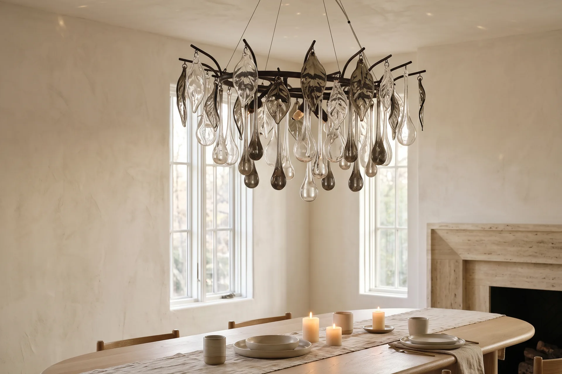
In a dining room or a drawing room this is a quiet pleasure. At full strength the light is clear and warm; at a low setting it takes on the colour of candlelight, exactly as the Kruithof curve would recommend. Dim-to-warm lamps suit chandeliers, pendants over tables and the table lamps you use late in the evening.
Make sure that dimmers and lamps suit one another. Not every LED lamp is dimmable, and some need a particular type of dimmer to glide down to the lowest level without flicker or hum. An electrician can choose a compatible combination, and a short test one evening shows whether the lowest setting is as gentle as it should be.
The truth of colour
Colour temperature describes the light itself; colour rendering describes what it does to the colours around it. The colour rendering index, or CRI, compares a source with a reference light of the same colour temperature on a scale up to 100. At 90 or more, wood, stone, textiles and skin appear natural and alive.
The general index is an average of several test colours and does not include saturated red. That colour has its own value, R9, which shows how well reds are rendered: the blush of a cheek, a bowl of cherries, the deep red of a rug or a lacquered box. A high R9 is worth asking for wherever people, food and rich textiles meet.
Check both values on the specification, alongside lumen and kelvin. A warm lamp with modest colour rendering can make a room look flat and brownish; a warm lamp with excellent rendering looks like late afternoon sun.
Mixing white light calmly
Unrest comes from mixing whites by accident. When a 4000 K ceiling light shines beside a 2700 K table lamp, the eye registers two different worlds, and the room feels unsettled. Keep one colour temperature for the general light in each room, so that ceiling lights, wall lights and concealed coves read as a single family.
Warmer accents can then be used deliberately: a table lamp at 2400 K beside an armchair, candles on the table, a picture light slightly warmer than the room. Cooler light belongs where tasks demand it, under kitchen cabinets or in a dressing room, ideally on its own circuit so that it can be switched off when evening comes.
The Lighting Planner suggests a colour temperature for each type of room, together with the lumen it needs and a mix of fittings, so that every layer of light can be planned within the same family of white.
Light has a temperature, and every evening deserves a warmer one.
Once you notice colour temperature, you see it everywhere: in the blue glow of a window at dusk, the gold of a lamp in a neighbour’s room, the pale clarity of a morning kitchen. At home it becomes a quiet instrument, tuned through the day, that lets each hour keep its own light.
Tool02 Lighting Planner Room type and floor area in, lumen, colour temperature and a balanced mix of lights out. Open the toolQuestions and answers
What colour temperature should I choose for a living room?
Warm white of about 2700 K suits living rooms and bedrooms, especially in the evening, because it feels restful and flatters skin and natural materials. Dim-to-warm lamps go further and turn towards candlelight as they are dimmed. A crisper white of 3000 to 4000 K suits kitchens and studies.
What is the Kruithof curve?
Published in 1941, the Kruithof curve relates comfortable colour temperatures to light levels. It suggests that at low light levels warm light appears most pleasing, while cooler light feels natural only when it is bright. It remains a useful rule of thumb for evening lighting at home.
What does R9 mean on a lamp specification?
R9 describes how well a light source renders saturated red, a colour that is not included in the general colour rendering index. A high R9 helps skin, food, wood and red textiles look natural and lively, so it is worth checking in dining rooms, bathrooms and dressing rooms.
Terms in this article
- Colour temperature
- The colour of white light expressed in kelvin, from the amber of a candle to the bluish white of daylight.
- Kruithof curve
- A curve published in 1941 that relates pleasing colour temperatures to light levels and favours warm light when it is dim.
- R9
- A colour rendering value that describes how faithfully a light source shows saturated red.
Filed underlightingkelvincolour temperaturedimmerscolour rendering